DevBlog 01: Font improvements and math failures
Today I had planned to implement some more of the missing features into Tarkov, and did eventually end up achieving that, but ended up spending far too long doing smaller jobs.
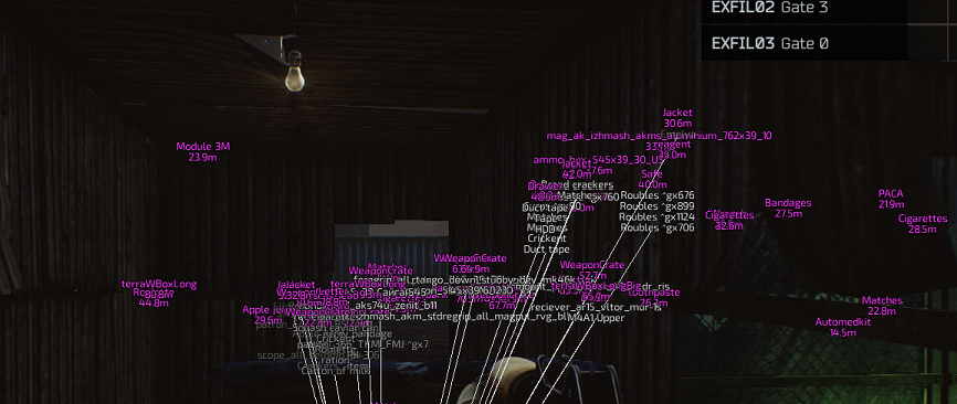
The first thing on my list was to implement loot esp into Tarkov. Simple enough, as it was mostly a case of copying the code from the old cheat into the new one and fixing up the differences. Well, for the most part this was true, except I made a stupid typo in the vector class that took me over 2 hours to diagnose.

Embarassing that it took me so long to spot it, but there you go.
After fixing this small but significant problem the loot ESP and snap lines were working correctly:

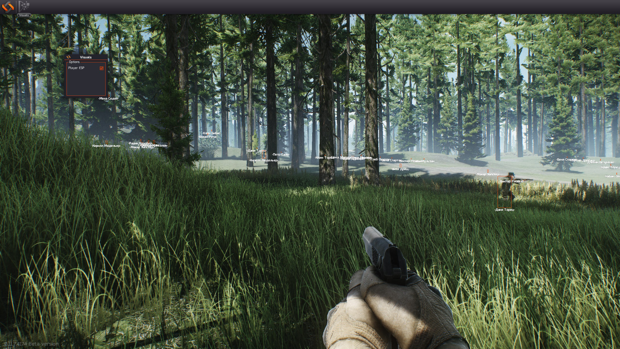
Something else that had been annoying me is the font renderer. If you look back to a post I made in September, the text is not looking great. The font is squashed together, the outline is really bad. And generally its not pleasant to look at.

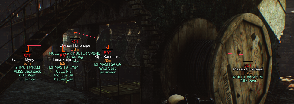
So to fix this, I fixed the spacing between characters by adjusting the amount of alpha that a pixel must emit before it is considered "the edge" of the glyph. Next up the outline, for this I changed the font pre-generator so that it doesn't smooth the outline, creating that kind of patchy outline you can see above.
The results looked like this:

Whilst I was making changes to the font system I also found a bug that once fixed, improved text rendering speeds by about 4x, the effects were immediately noticeable and the ESP is silky smooth now.
That's it for today, more soon...
-
 37
37
-
 8
8

43 Comments
Recommended Comments